GDPRsimple SaaS Platform
GDPRsimple is a first-of-its-kind product helping small and medium-sized businesses manage their data protection practices in accordance with GDPR. With the SaaS platform, businesses can maintain their data policy records in one place as well as generate relevant privacy documentation. The platform also educates companies about data protection matters and best practices.
PROJECT SNAPSHOT
Timeline
The project spanned about 5-6 months.
My Role
I initially worked with another UX designer, a project manager and two engineers to build the MVP. Halfway through the timeline my fellow UX designer left to join other projects. I became the UX design lead and continued working on UX/UI for new features and led usability testing.
Results
By the end of the project a complete design for the initial MVP launch was produced.
EARLY DESIGN
DOCUMENT-CENTRIC V. SUBJECT-CENTRIC
In order to have an efficient wireframing process my co-UX designer and I decided to divide up the work as such: I worked on designing our initial visual concept and low-fidelity wireframes and she designed the medium and high-fidelity wireframes. However, we quickly came to a crossroads as we had differing opinions on the structure of the platform, centering around either a document-centric approach versus a subject-centric approach.
My colleague felt GDPRsimple should be oriented around helping businesses generate needed compliance documents. I felt the product should have a broader tone and be divided into subject-matter areas that housed both document generation as well as learning material. It is important to note that the client gave feedback to support both perspectives.
To find a resolution we conducted a design studio led by our design director. We were able to combine both of our ideas into a single design concept. The portal homepage featured a 'My Recent Documents' section that gave users quick access to relevant documents, as well as a secondary navigation menu allowing users to quickly access subject areas of GDPR.
In the final iteration the design was further streamlined. A homepage menu was created that integrates notifications and that also directs users to the specific subject-area sections. The left-hand secondary navigation when expanded continues to offer another pathway to access these module sections.
DESIGN ITERATION
PROJECT PIVOT: FROM REQUEST LOG TO INTERACTIVE GUIDE
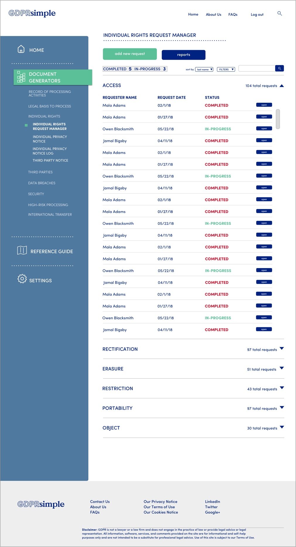
As the project continued my colleague was pulled onto another project and I worked on the continuing stages of GDPRsimple. One of the most challenging sections I worked on was the ‘Individual Rights Request Manager’. Initially, this section was to be a ledger for companies to track different types of data privacy requests from users. I began reviewing the reference material accompanying this section and discovered that responding to each request was very involved. I pitched that in addition to the log, the section include an interactive checklist to guide businesses through the steps needed to respond to an individual rights request. Our team pivoted and we changed the ‘Individual Rights Log’ to the ‘Individual Rights Request Manager’.
Log capturing incoming requests
Added checklist with steps for responding to requests
DESIGN
USABILITY TESTING
I conducted a round of usability testing upon completion of the high-fidelity wireframes to validate assumptions and identify areas to further refine GDPRsimple.
Created script.
I created a script for all of the testing sessions, which included about two to three tasks and specific usability questions.
Led testing sessions.
I facilitated testing with six different participants who were recruited by the client. Testing was done both in person and remotely.
Prepared report.
I wrote a summary report that included the main findings from the testing as well as major design recommendations.
The four main recommendations from usability testing were:
1. Adjusting content. For many users the language was too formal and overwhelming.
2. Redesigning the 'Direct Marketing Consent' Generator. For many users this section, which asks users to complete a form, was not intuitive. Users wanted questions to appear before the form and have the form change dynamically as they answered questions.
3. Swapping Key Term Highlight For Underlines. Key terms were denoted by a green highlight; once a user hovered over the highlighted term a pop-up would appear with the definition of the word. However, most users did not understand that the highlight signified this affordance. Several testers mentioned being more familiar with the use of an underline to denote interactivity.
4. Add Examples/Context Directly to Questions. Users wanted more guidance to answer questions for document generation. Testers wanted more examples presented directly with the questions.
Due to a lack of time, our engineers could not adopt all of the recommendations. However, some changed were made:
The highlight over the key terms were replaced with underlines.
The format for the 'Direct Marketing Consent' generator was altered so that the questions appear first in the section. Users can then see a preview of what the form looks like with their responses integrated.


